If you’ve been around here long, you know I’m a fan of the challenge where I try new things, or concentrate on a particular skill for 30 days. This month, I’ve decided to devote the month to practicing my lettering skills including calligraphy, other hand lettering, and digital lettering.
Much of this work will probably include studies of typefaces and other peoples work. I think studies are an excellent way to learn. You can dive into something by studying something that was successful. You can figure out how it was done and how all the pieces fit. I think it also helps one develop an eye for what’s good and what’s not. I hope to share some original and some “inspired by” pieces here throughout the month.
For my first practice session, I decided to letter the Taft Stadium logo from the photo that I shared during August Break. As I began to draw it, I noticed that the Stadium letters were a little wacky. The weights weren’t consistent. Notice how the on some letters the left side of the letter is heavier but on some the weight is on the right side. Every class I’ve ever taken on lettering warns against doing this, so it was a little like fingernails on a chalkboard as I worked. But I did it. It’s funny how you can see something for years and not really notice those things but when you go to sketch it, it’s very obvious.
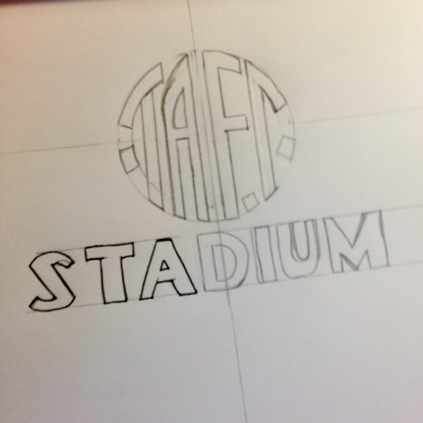
Here’s my final rough pencil sketch. It took awhile to work out the math of the letters. It’s not perfect but it’s a lot better than when I first began. I began outlining in pen before I remembered I wanted to take a photo.
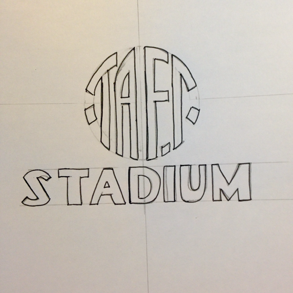
Here it is outlined and ready to be filled in.
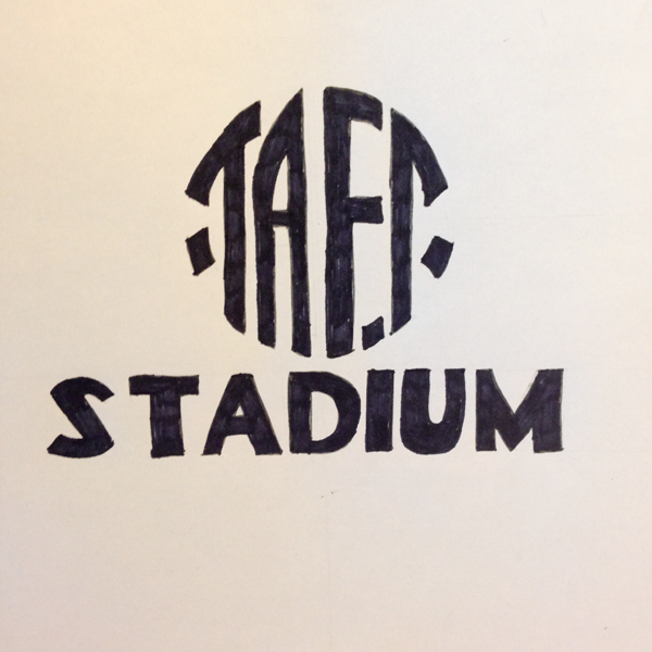
Here’s the final filled in sketch. It’s been a long time since I “colored.” I sometimes found myself a bit out of the lines.
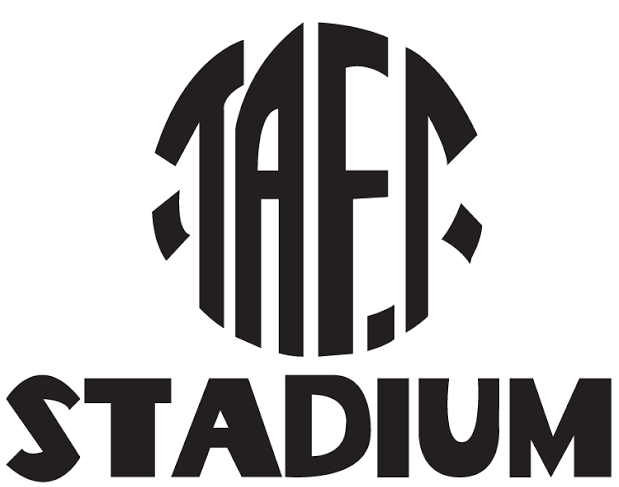
And here’s the final digitized version. I can still se a lot of flaws in it (especially the off-balance “F” in TAFT. I still have a lot of practice to do on the whole process. But that’s what this month is for. What do you want to learn or practice this month? Will you join me?
Leave a Reply